DC Menu App
DC Menu App
DC Menu App
DC Menu App
Case Study + App Design
Case Study + App Design




Timeline
Timeline
Oct 2023- Jun 2024
Oct 2023- Jun 2024
Role
Role
Product Designer
Berlin
Design Tools
Design Tools
Figma | FigJam
Figma | FigJam |
Project Management Tools
Project Management Tools
Slack | Jira | Notion
50-101
Problem
Currently, the dining commons at UC Davis are divided across four separate websites, making it difficult for students and staff to easily navigate between them. Viewing operational hours for each dining hall and their individual stations is complicated, and there is no functionality to favorite preferred dishes or track nutritional information, such as macros. This lack of cohesion and beneficial features results in a frustrating user experience, especially for those with specific dietary needs.
Goal
The goal of the DC Menu App project is to design and develop a streamlined, user-friendly mobile app that intuitively combines the dining commons information into a single platform. The app will allow users to easily view operational hours, favorite their preferred food items, track macros, and apply dietary filters to menus. The focus is on creating a seamless experience that caters to the needs of both students and staff, enhancing convenience and accessibility.
Process
Process
01
Research & Analysis
02
Style Guide
We conducted user interviews, surveys, and analyzed in-app analytics to understand the pain points and user needs. We also studied competitor apps and industry trends to gather insights
03
Wireframing + Prototyping
We conducted user interviews, surveys, and analyzed in-app analytics to understand the pain points and user needs. We also studied competitor apps and industry trends to gather insights
04
User Testing + Mockups
We conducted user interviews, surveys, and analyzed in-app analytics to understand the pain points and user needs. We also studied competitor apps and industry trends to gather insights
05
Handoff + Conclusion

Research + Analysis
Research + Analysis
Research + Analysis
To start, we needed to identify our target audience. Freshmen and transfer students, who are the primary users of dining plans, make up the majority of those who frequent the dining commons, narrowing our target audience to around 10,000 students. This helped us focus on who to engage with during the research and testing phases of the design process.
To start, we needed to identify our target audience. Freshmen and transfer students, who are the primary users of dining plans, make up the majority of those who frequent the dining commons, narrowing our target audience to around 10,000 students. This helped us focus on who to engage with during the research and testing phases of the design process.
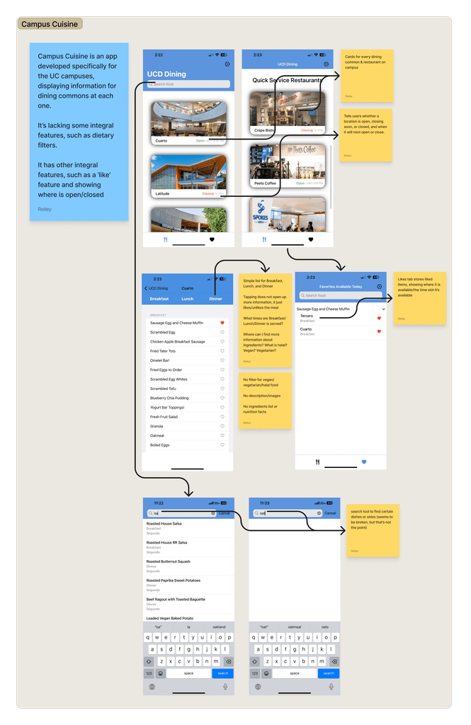
Next, we identified the key features that would be most beneficial and appealing to our target users. We conducted a comparative analysis by examining potential competitors and the features they offered. We discovered that three core features were commonly present in similar apps: a list of dining locations, their opening and closing times, and information on when specific menu items were available.
Next, we identified the key features that would be most beneficial and appealing to our target users. We conducted a comparative analysis by examining potential competitors and the features they offered. We discovered that three core features were commonly present in similar apps: a list of dining locations, their opening and closing times, and information on when specific menu items were available.
Additionally, we found that some apps already incorporated features we were considering, such as dietary filters, nutritional information, and the ability to favorite items. However, we also noticed that while these apps did list nutritional information for food items, they didn't include a feature that allows a user to easily track their macros. Recognizing that college students often have hectic and busy schedules, we determined that including a feature to quickly add food items to a macro tracking page would be beneficial.
Additionally, we found that some apps already incorporated features we were considering, such as dietary filters, nutritional information, and the ability to favorite items. However, we also noticed that while these apps did list nutritional information for food items, they didn't include a feature that allows a user to easily track their macros. Recognizing that college students often have hectic and busy schedules, we determined that including a feature to quickly add food items to a macro tracking page would be beneficial.


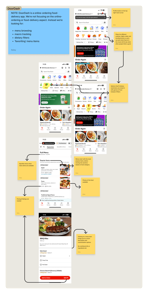


In addition to comparative analysis, we also conducted interviews and student surveys to gain a deeper insight to which features would be most beneficial to students.
In addition to comparative analysis, we also conducted interviews and student surveys to gain a deeper insight to which features would be most beneficial to students.
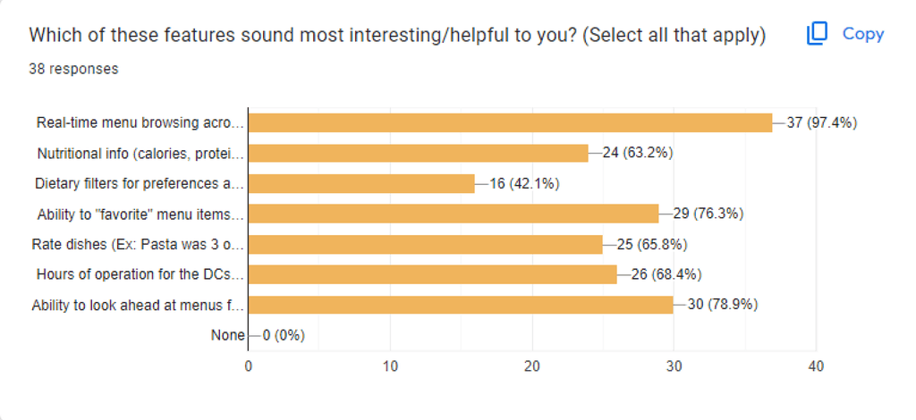


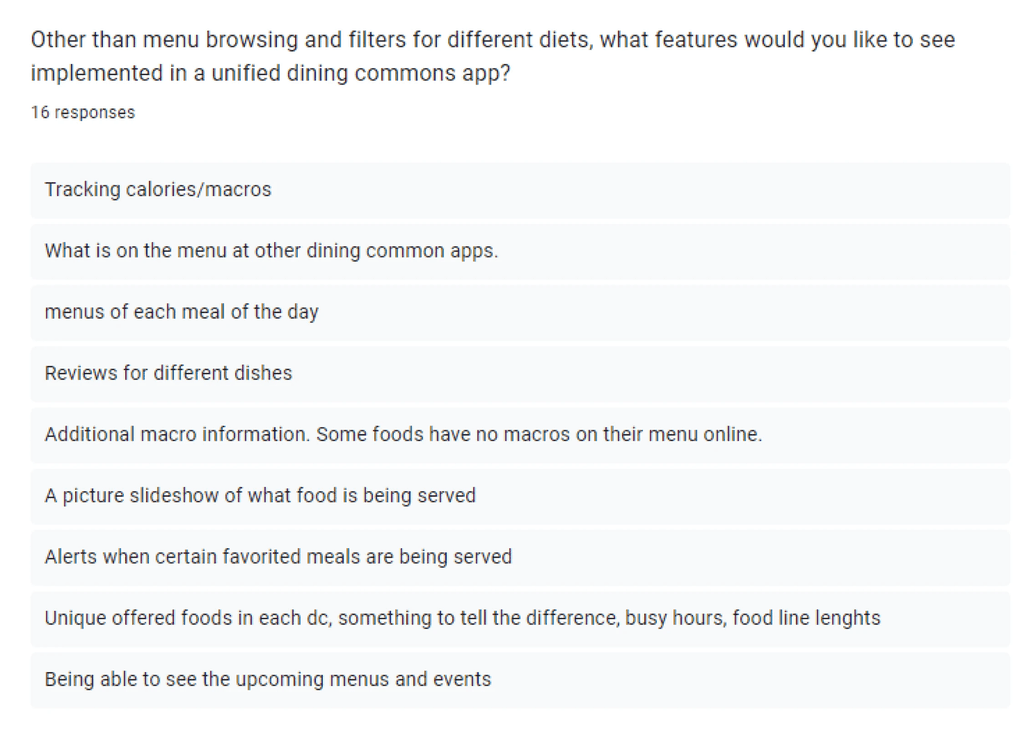


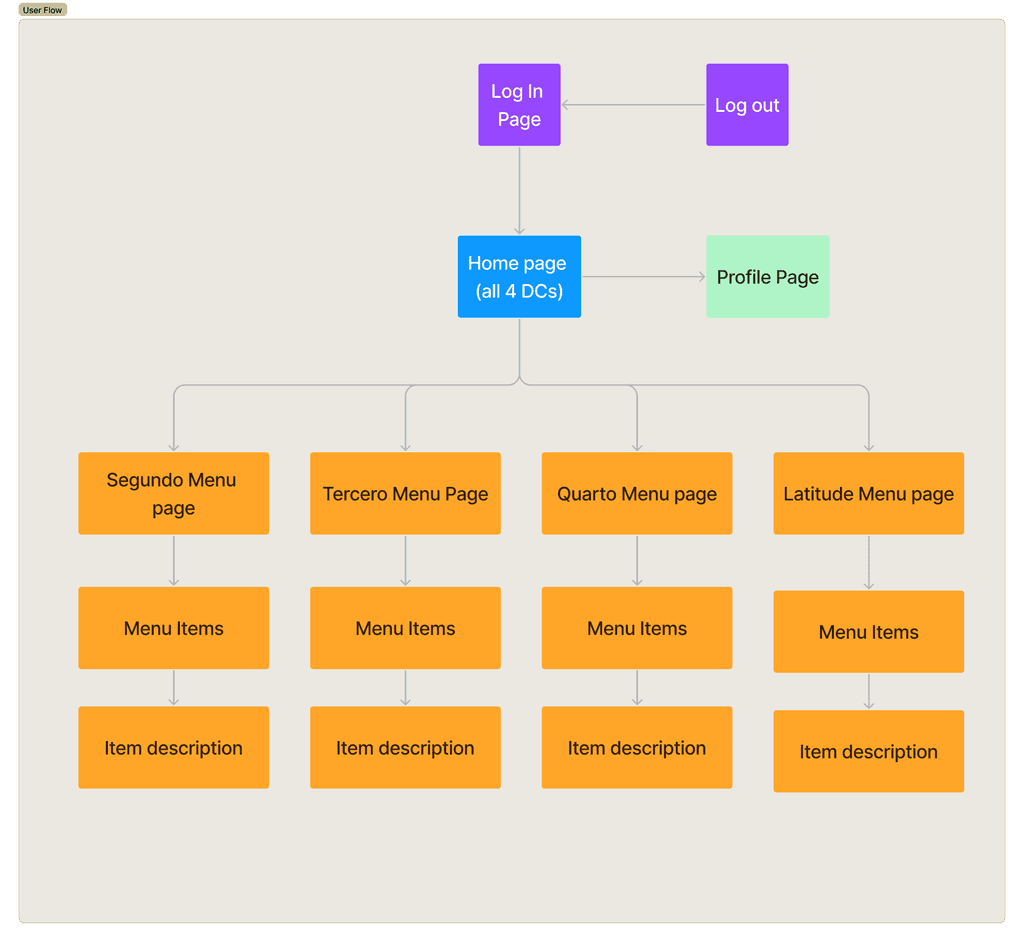
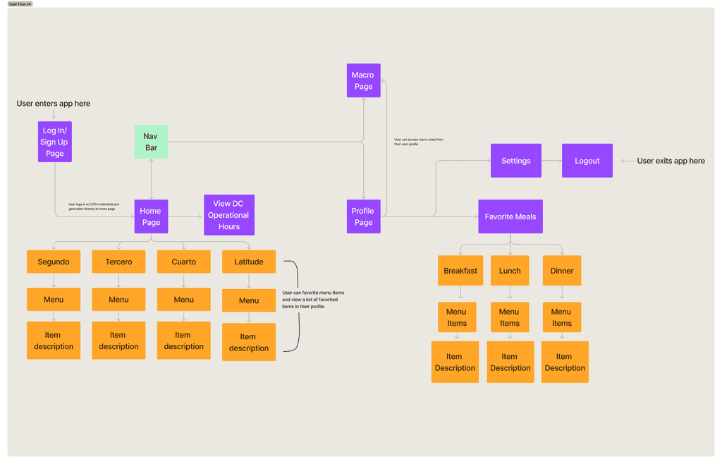
These research processes assisted us in the creation of our user flow diagrams. We started with the most basic user flow to get a simple idea of how a user would navigate throughout the app. Through multiple iterations during our ideation phase, we were left with our final, most accurate user flow.
These research processes assisted us in the creation of our user flow diagrams. We started with the most basic user flow to get a simple idea of how a user would navigate throughout the app. Through multiple iterations during our ideation phase, we were left with our final, most accurate user flow.






Visual Design + Style Guide
Visual Design + Style Guide
Visual Design + Style Guide


Following the research phase, it was now time to determine a style guide and begin planning the visual staples of our apps' design.
Following the research phase, it was now time to determine a style guide and begin planning the visual staples of our apps' design.
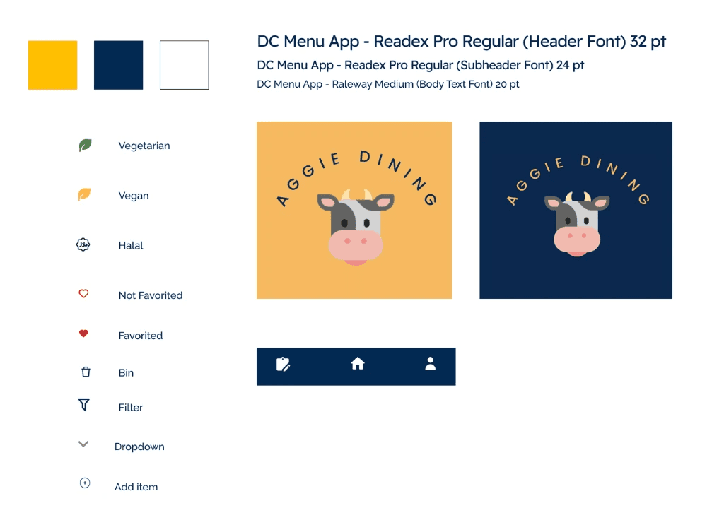
We first took inspiration from the current UC Davis Student ID cards which are composed of yellow, dark blue, baby blue, and white. However, this was quickly altered when we decided to forgo the baby blue color and focus on three main tones: dark blue, gold, and white.
We first took inspiration from the current UC Davis Student ID cards which are composed of yellow, dark blue, baby blue, and white. However, this was quickly altered when we decided to forgo the baby blue color and focus on three main tones: dark blue, gold, and white.
After determining the primary colors our focus went into finding fonts for our headers and body text. We wanted something clean, simple, and easy to read. Luckily, the official UC Davis font "Proxima Nova" ticked all of those boxes. We were able to find a close resemblance on Figma, "Readex Pro" which became the primary font for our app.
After determining the primary colors our focus went into finding fonts for our headers and body text. We wanted something clean, simple, and easy to read. Luckily, the official UC Davis font "Proxima Nova" ticked all of those boxes. We were able to find a close resemblance on Figma, "Readex Pro" which became the primary font for our app.
Lastly, we chose the icons we would be using throughout the app such as the heart icon, home, profile, macros, arrows, and more. We were now all set to begin wireframing.
Lastly, we chose the icons we would be using throughout the app such as the heart icon, home, profile, macros, arrows, and more. We were now all set to begin wireframing.
Wireframing + Prototyping
Wireframing + Prototyping
Wireframing + Prototyping
The entire design process consisted of many iterations, starting from lo-fi sketches and wireframes and progressing towards final workable mockups. Each step along the way focused on the refinement of the overall user experience.
The entire design process consisted of many iterations, starting from lo-fi sketches and wireframes and progressing towards final workable mockups. Each step along the way focused on the refinement of the overall user experience.
Low-Fidelity Sketches
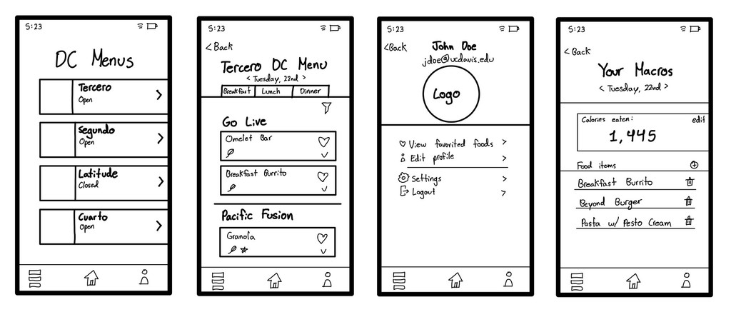
We began by creating very basic, low-fi sketches of the app pages. This phase was less about the looks of the app and more about the overall functionality and placement of primary features.
We began by creating very basic, low-fi sketches of the app pages. This phase was less about the looks of the app and more about the overall functionality and placement of primary features.


Mid-Fidelity Prototypes
After creating the very base-line of our designs and with a simple layout, we began creating various mid-fi prototypes in Figma incorporating text, colors, and basic icons. At this point, the app started to come together with some edits that still needed to be made to some of the color combinations and many of the small details that had not yet been incorporated into the design.
After creating the very base-line of our designs and with a simple layout, we began creating various mid-fi prototypes in Figma incorporating text, colors, and basic icons. At this point, the app started to come together with some edits that still needed to be made to some of the color combinations and many of the small details that had not yet been incorporated into the design.
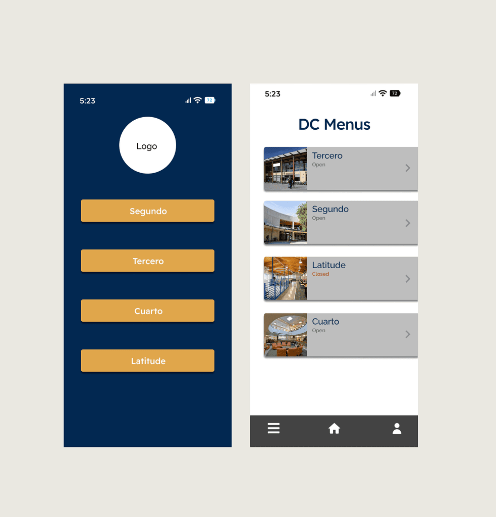


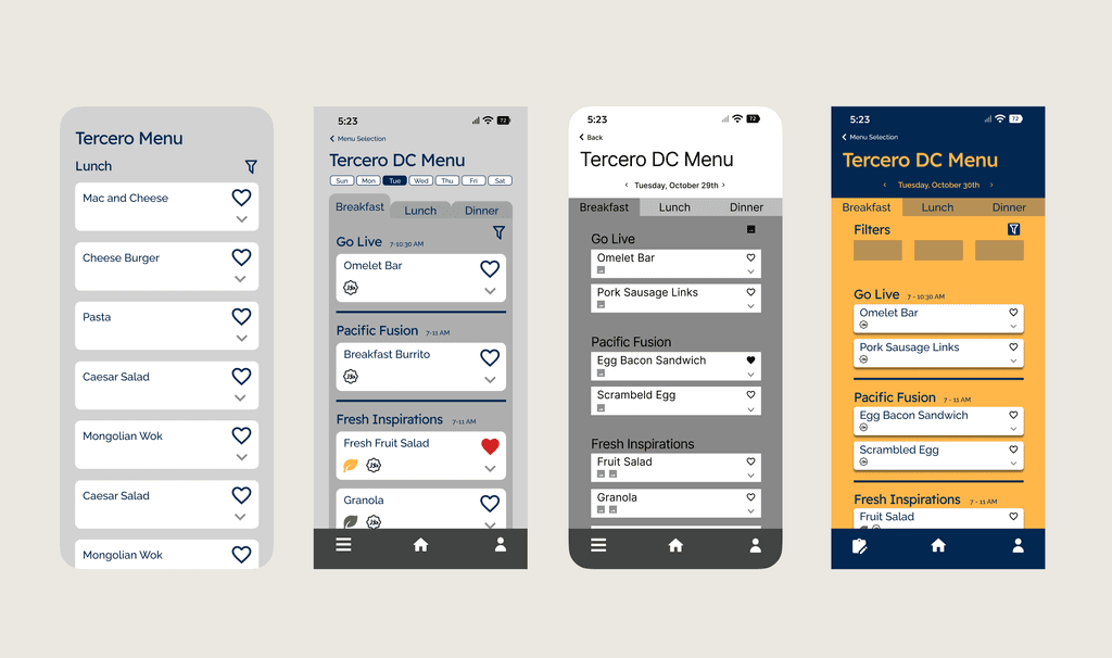


At this stage of the the design process, we also had our first round of usability testing. This consisted of A/B testing as well as interviews and guided tasks that users completed which we observed to see if navigating the app was as simple as we had hoped. After conducting this round of usability testing, this is the feedback that we received.
At this stage of the the design process, we also had our first round of usability testing. This consisted of A/B testing as well as interviews and guided tasks that users completed which we observed to see if navigating the app was as simple as we had hoped. After conducting this round of usability testing, this is the feedback that we received.


High-Fidelity Prototypes
With the initial round of usability testing behind us, we began designing the hi-fi prototypes which included using the style guide as a base line to determine the placement of images and colors, making small adjustments to icons and their placement, and adding some final pages such as the profile page and settings.
With the initial round of usability testing behind us, we began designing the hi-fi prototypes which included using the style guide as a base line to determine the placement of images and colors, making small adjustments to icons and their placement, and adding some final pages such as the profile page and settings.
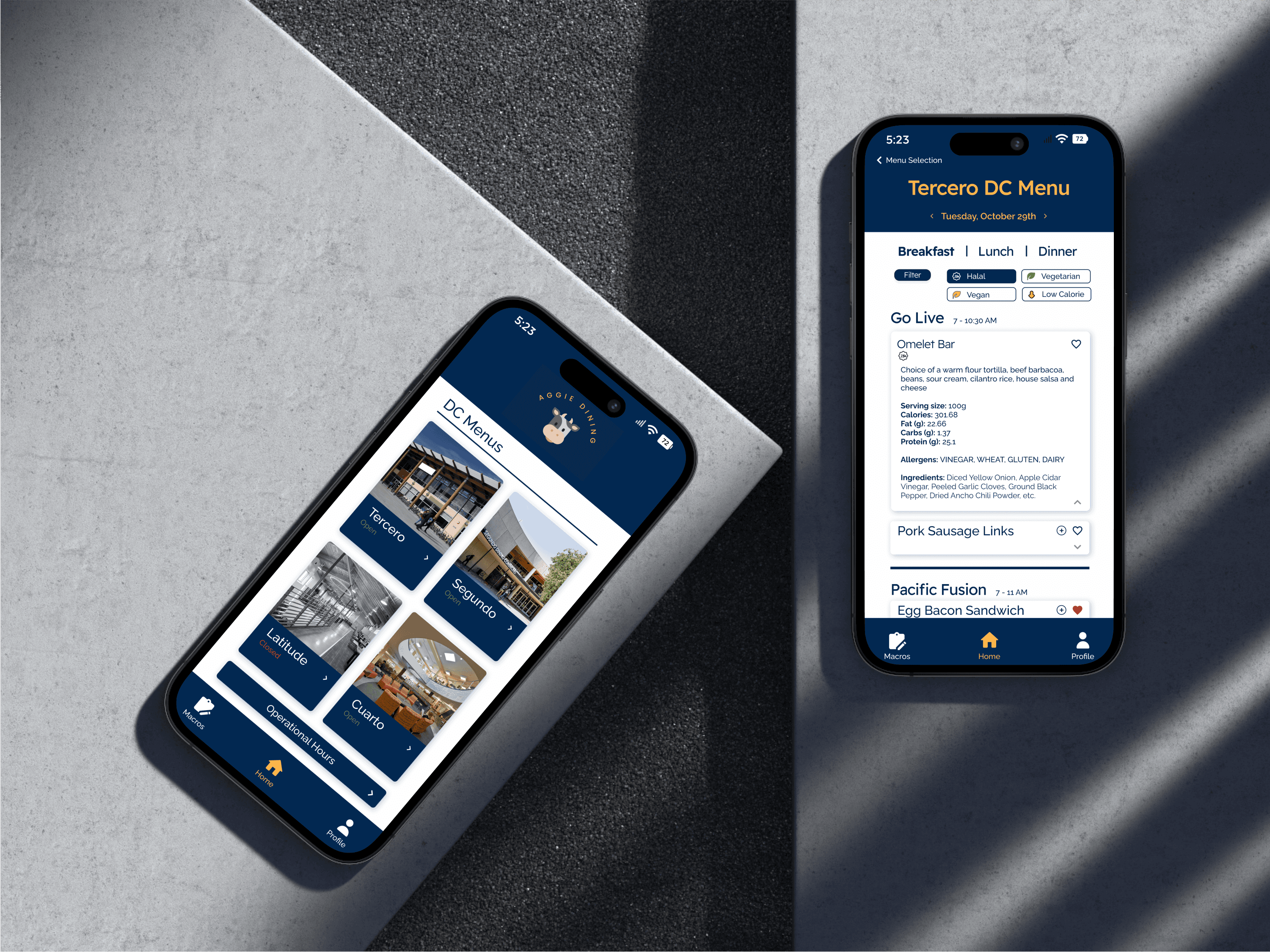
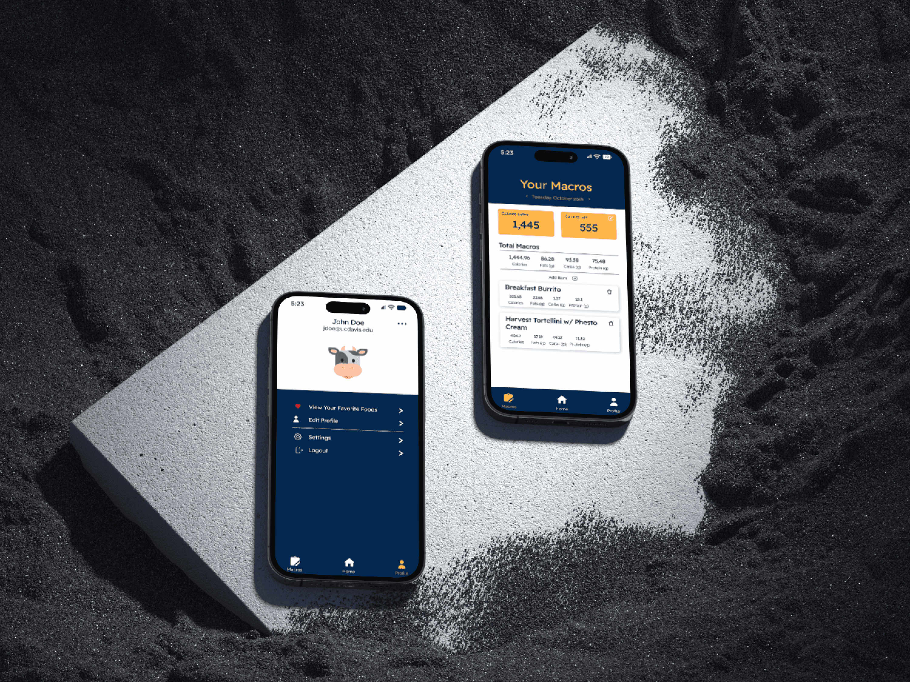
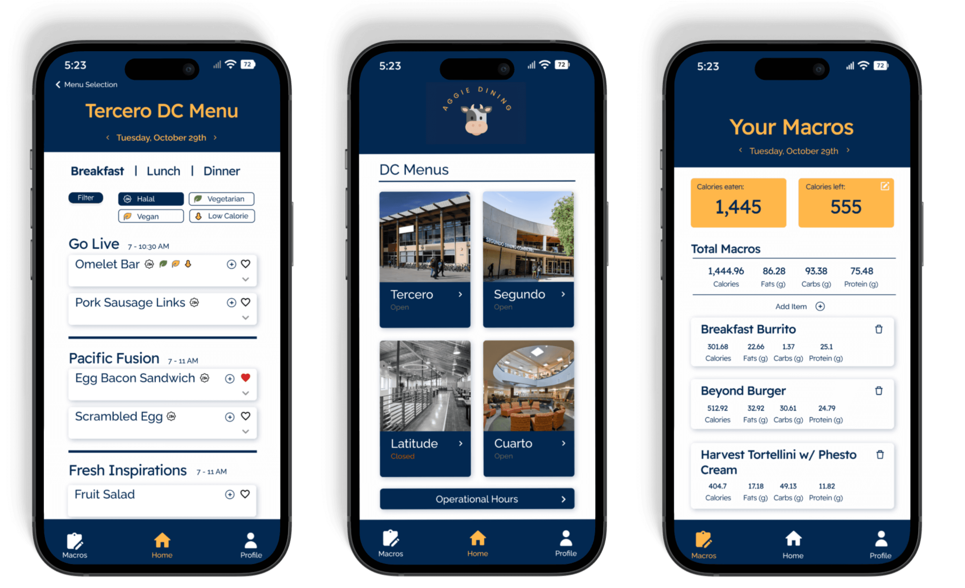
During this hi-fi phase I was tasked with redesigning some of the primary pages including the home page which became a grid-layout with an added button that allows users to view all dining common hours in one location. In addition, I also completely redesign the macros page, now allowing users to see their current calories and how many calories then can consume for the rest of the day to meet their goals. Users could now also edit their macro goals and input or delete meal items directly from the macros page.
During this hi-fi phase I was tasked with redesigning some of the primary pages including the home page which became a grid-layout with an added button that allows users to view all dining common hours in one location. In addition, I also completely redesign the macros page, now allowing users to see their current calories and how many calories then can consume for the rest of the day to meet their goals. Users could now also edit their macro goals and input or delete meal items directly from the macros page.
For the menu page, the layout remained the same with some tweaks to the radius of buttons, font size, filters, and navigation. We changed the way the users can view the different meal times, as well as simplified the UI for choosing the day of the week. Additionally, we added a button that allowed users to directly add meals to their macros page to create a more seamless user experience.
For the menu page, the layout remained the same with some tweaks to the radius of buttons, font size, filters, and navigation. We changed the way the users can view the different meal times, as well as simplified the UI for choosing the day of the week. Additionally, we added a button that allowed users to directly add meals to their macros page to create a more seamless user experience.


User Testing + Final Mockups
User Testing + Final Mockups
User Testing + Final Mockups
Before final handoff to the development team, we conducted a final round of user testing to determine any last-minute adjustments that needed to be made.
Before final handoff to the development team, we conducted a final round of user testing to determine any last-minute adjustments that needed to be made.
Here, we made some buttons easier to press, some text easier to read, and made some color combination changes to make certain elements pop.
Here, we made some buttons easier to press, some text easier to read, and made some color combination changes to make certain elements pop.
We created a final mockup of the app using Figma prototyping tools to see how the app would look and function on a mobile device.
We created a final mockup of the app using Figma prototyping tools to see how the app would look and function on a mobile device.
Handoff + Conclusion
Handoff + Conclusion
Handoff + Conclusion
After completing final adjustments and creating a finalized mockup and the dev-ready set of final hi-fi pages of the app, it was time to handover to the developer team to develop the project.
After completing final adjustments and creating a finalized mockup and the dev-ready set of final hi-fi pages of the app, it was time to handover to the developer team to develop the project.
As designers, we made sure to stay in touch frequently with the dev team to explain any features or sort out any confusion that might arise in the conversion from design to final product.
As designers, we made sure to stay in touch frequently with the dev team to explain any features or sort out any confusion that might arise in the conversion from design to final product.
Key Takeaways
While designing the prototypes and mockups is often the most exciting and creative part of the design process, this project reinforced that every aspect of the process is equally important in shaping the final product. From initial research and planning to user testing and iteration, each step played a vital role in ensuring the DC Menu App was not only functional but also user-friendly and aligned with the needs of our target audience.
While designing the prototypes and mockups is often the most exciting and creative part of the design process, this project reinforced that every aspect of the process is equally important in shaping the final product. From initial research and planning to user testing and iteration, each step played a vital role in ensuring the DC Menu App was not only functional but also user-friendly and aligned with the needs of our target audience.
User testing and research, often overlooked in favor of visual design, proved to be especially valuable. Many of the suggestions we received during user testing, such as defining specific meal serving times and improving the layout of the navigation, directly influenced key features of the app. These insights helped refine the overall user experience, making the app far more intuitive and useful than it might have been without this feedback. This project highlighted how important it is to balance creativity with logistics, ensuring that the end product is both engaging and practical.
Thanks for reading!
Check out my other projects!
Check out my other projects!
Check out my other projects!


ProfitBreeze
Website Landing Page
