ModaMate
ModaMate
ModaMate
ModaMate
Website + App Design


Timeline
Timeline
Aug 2024 - Present
Aug 2024 - Present
Role
Role
Product Designer
Product Designer
Design Tools
Design Tools
Figma | Shopify | Canva
Shopify | Canva | Shopney
Problem
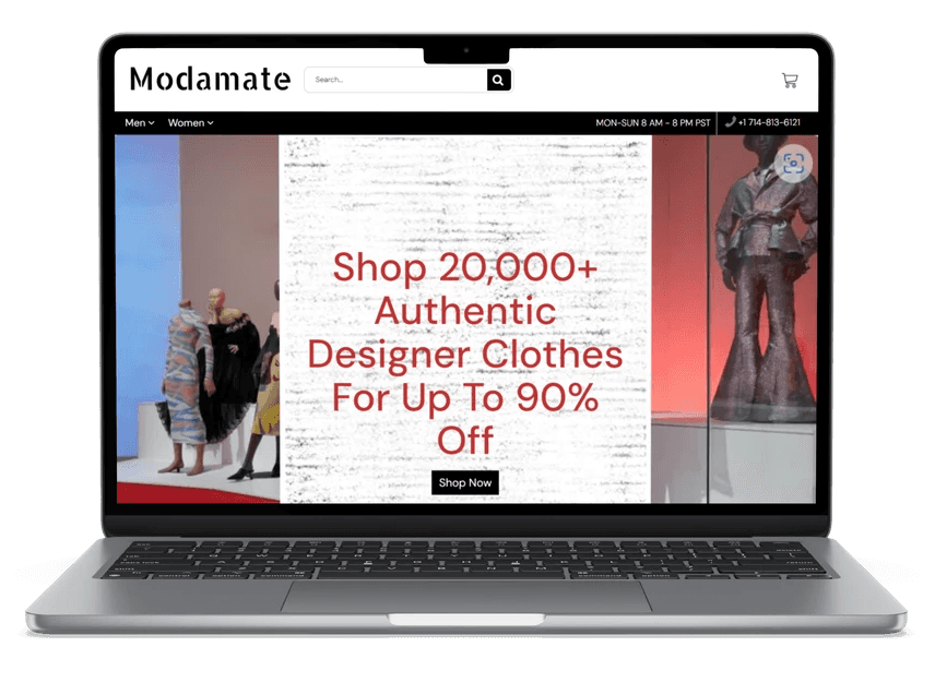
The previous design of the ModaMate online store was outdated and lacked coherence. The website featured a poor choice of fonts, unattractive images, and a disorganized layout, which made navigation difficult and detracted from the user experience. Additionally, there was no dedicated mobile application, limiting accessibility for users shopping on-the-go.
Goal
The goal of this project was to completely redesign the ModaMate website from the ground up and develop a new mobile app to enhance the overall shopping experience. The redesign focused on creating a modern, visually appealing interface with consistent fonts, improved imagery, and an intuitive, well-structured layout. The project aimed to ensure seamless navigation across both web and mobile platforms, with a focus on aesthetics and user-friendly functionality.
Previous ModaMate Website Design
Previous ModaMate Website Design
Previous ModaMate Website Design


Process
Process
Process
01
Layout + Inspiration
02
Visual Design + Style Guide
We conducted user interviews, surveys, and analyzed in-app analytics to understand the pain points and user needs. We also studied competitor apps and industry trends to gather insights
03
Prototyping
We conducted user interviews, surveys, and analyzed in-app analytics to understand the pain points and user needs. We also studied competitor apps and industry trends to gather insights
04
Mobile Design
We conducted user interviews, surveys, and analyzed in-app analytics to understand the pain points and user needs. We also studied competitor apps and industry trends to gather insights
05
Conclusion + Takeaway

01
Research & Analysis
02
Style Guide
We conducted user interviews, surveys, and analyzed in-app analytics to understand the pain points and user needs. We also studied competitor apps and industry trends to gather insights
03
Wireframing + Prototyping
We conducted user interviews, surveys, and analyzed in-app analytics to understand the pain points and user needs. We also studied competitor apps and industry trends to gather insights
04
User Testing + Mockups
We conducted user interviews, surveys, and analyzed in-app analytics to understand the pain points and user needs. We also studied competitor apps and industry trends to gather insights
05
Handoff + Conclusion
01
Layout + Inspiration
02
Visual Design + Style Guide
We conducted user interviews, surveys, and analyzed in-app analytics to understand the pain points and user needs. We also studied competitor apps and industry trends to gather insights
03
Prototyping
We conducted user interviews, surveys, and analyzed in-app analytics to understand the pain points and user needs. We also studied competitor apps and industry trends to gather insights
04
Mobile Design
We conducted user interviews, surveys, and analyzed in-app analytics to understand the pain points and user needs. We also studied competitor apps and industry trends to gather insights
05
Conclusion + Takeaway

01
Research & Analysis
02
Style Guide
We conducted user interviews, surveys, and analyzed in-app analytics to understand the pain points and user needs. We also studied competitor apps and industry trends to gather insights
03
Wireframing + Prototyping
We conducted user interviews, surveys, and analyzed in-app analytics to understand the pain points and user needs. We also studied competitor apps and industry trends to gather insights
04
User Testing + Mockups
We conducted user interviews, surveys, and analyzed in-app analytics to understand the pain points and user needs. We also studied competitor apps and industry trends to gather insights
05
Handoff + Conclusion

Layout + Inspiration
Layout + Inspiration
Layout + Inspiration
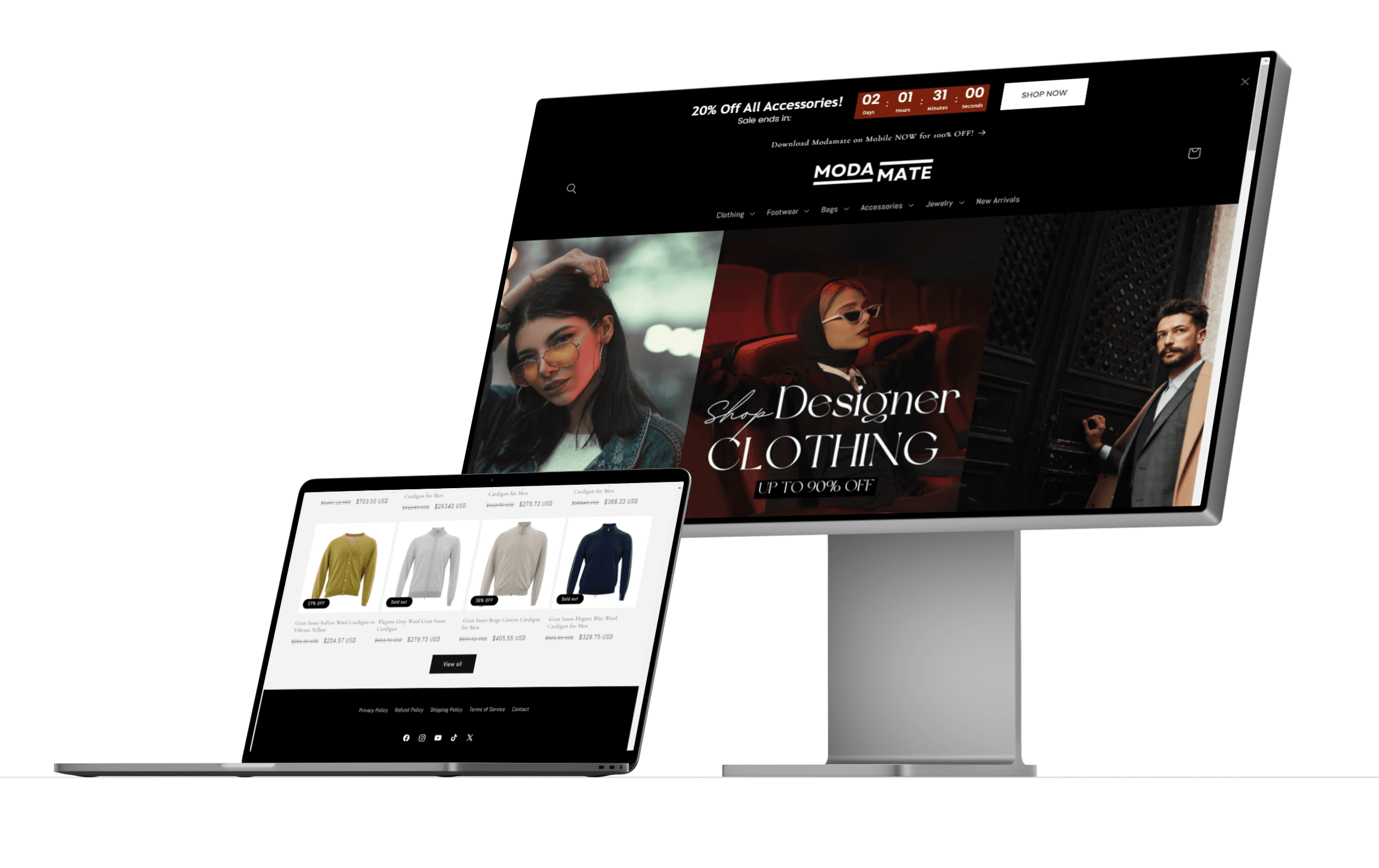
The first step in redesigning ModaMate was developing a clear and modern layout. I drew inspiration from high-end online retail giants like Nordstrom and Neiman Marcus. My goal was to create a visually engaging website that captivated visitors the moment they landed on the homepage.
The first step in redesigning ModaMate was developing a clear and modern layout. I drew inspiration from high-end online retail giants like Nordstrom and Neiman Marcus. My goal was to create a visually engaging website that captivated visitors the moment they landed on the homepage.
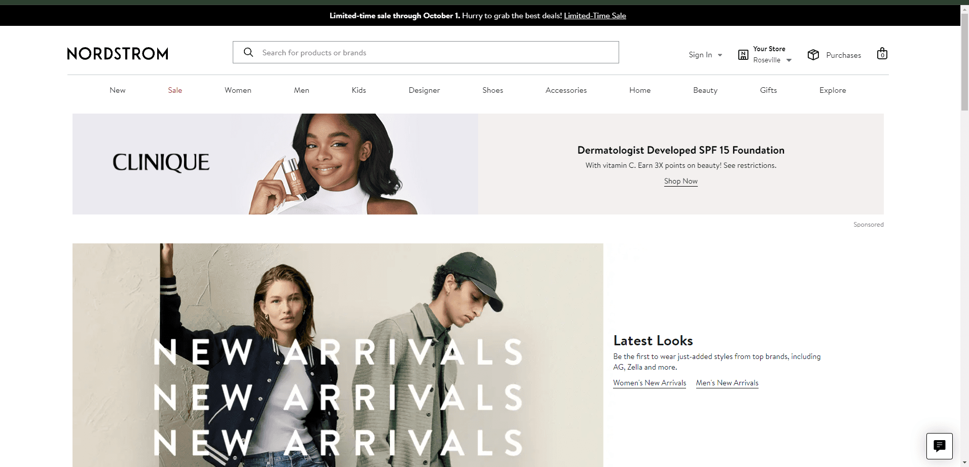


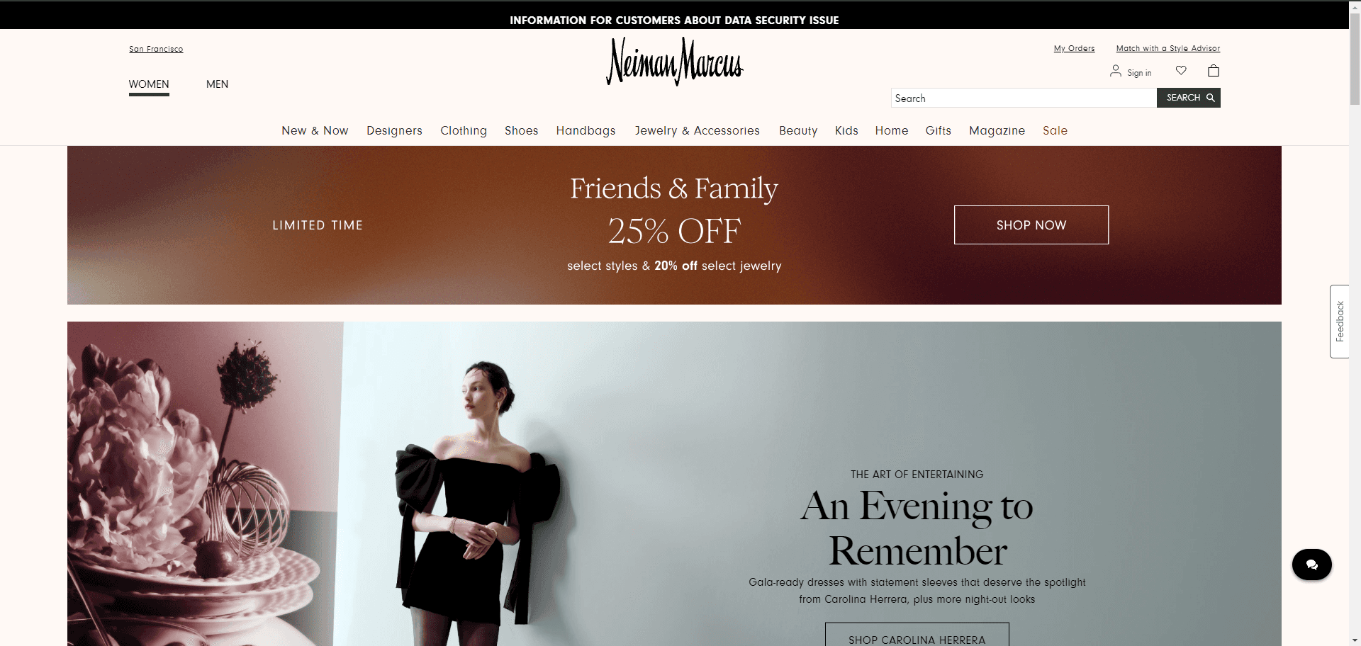


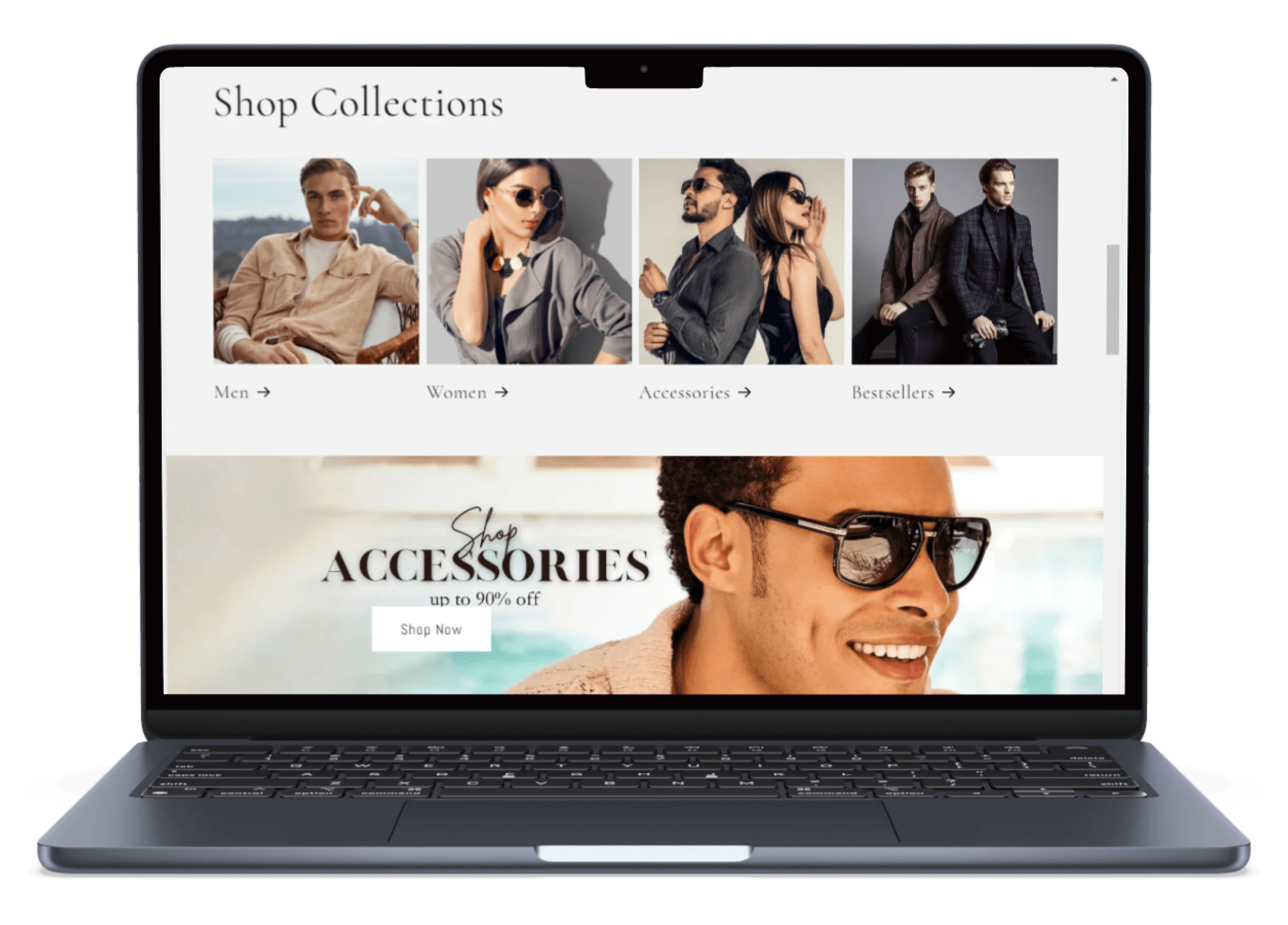
I envisioned a large, high-quality image block with an eye-catching visual and text overlay, accompanied by an obvious action button prompting users to start shopping. At the top of the page, I wanted a clean, minimalist navigation bar and logo to ensure easy access to different shopping categories. Following the main image block, I would incorporate a section element where users could switch between collections such as "Women," "Men," and "Best Sellers."
I envisioned a large, high-quality image block with an eye-catching visual and text overlay, accompanied by an obvious action button prompting users to start shopping. At the top of the page, I wanted a clean, minimalist navigation bar and logo to ensure easy access to different shopping categories. Following the main image block, I would incorporate a section element where users could switch between collections such as "Women," "Men," and "Best Sellers."
To further enhance user interaction, I planned on including a sliding image carousels displaying advertisements for various clothing categories. Below this would be a small banner ad, followed by an "About Us" section and key company information such as return policy, shipping details, and general company goals.
To further enhance user interaction, I planned on including a sliding image carousels displaying advertisements for various clothing categories. Below this would be a small banner ad, followed by an "About Us" section and key company information such as return policy, shipping details, and general company goals.
Finally, the bottom of the homepage would feature a curated "Featured Products" section, showcasing selected items with high-quality images. I would add a footer containing essential information such as contact details, social media links, privacy policies, and terms of service. This layout was designed to be both functional and visually appealing, providing a seamless shopping experience from top to bottom.
Finally, the bottom of the homepage would feature a curated "Featured Products" section, showcasing selected items with high-quality images. I would add a footer containing essential information such as contact details, social media links, privacy policies, and terms of service. This layout was designed to be both functional and visually appealing, providing a seamless shopping experience from top to bottom.
Visual Design + Style Guide
Visual Design + Style Guide
Visual Design + Style Guide
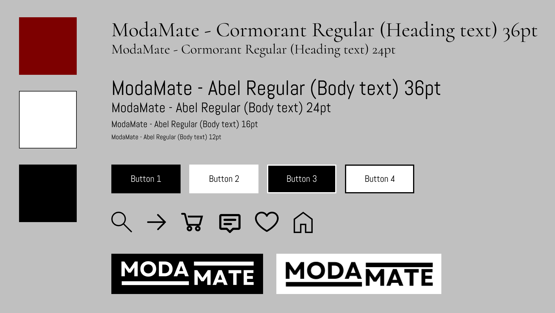


The next critical step was crafting a style guide that would serve as the visual foundation for the entire ModaMate website. I wanted to establish a modern and sophisticated look, so I opted for a combination of dark tones paired with contrasting light elements. The primary theme featured a sleek black background with crisp white font, creating a refined, minimalist feel. To add a touch of richness, I used a dark maroon red as the accent color, bringing warmth and a sense of luxury to the design.
The next critical step was crafting a style guide that would serve as the visual foundation for the entire ModaMate website. I wanted to establish a modern and sophisticated look, so I opted for a combination of dark tones paired with contrasting light elements. The primary theme featured a sleek black background with crisp white font, creating a refined, minimalist feel. To add a touch of richness, I used a dark maroon red as the accent color, bringing warmth and a sense of luxury to the design.
For typography, I wanted fonts that conveyed both elegance and simplicity. I chose Cormorant for headings, as its aesthetic gives off a high-end feel. For body text, I chose Abel, a more streamlined and readable font that balances luxury with clarity. This combination ensured the site remained visually striking yet easy to read.
For typography, I wanted fonts that conveyed both elegance and simplicity. I chose Cormorant for headings, as its aesthetic gives off a high-end feel. For body text, I chose Abel, a more streamlined and readable font that balances luxury with clarity. This combination ensured the site remained visually striking yet easy to read.
The logo was designed with simplicity and readability in mind, ensuring it was clean and bold while maintaining a sense of brand identity. To complement the minimalistic theme, I also selected simple, modern icons for navigation and functional elements across the site.
The logo was designed with simplicity and readability in mind, ensuring it was clean and bold while maintaining a sense of brand identity. To complement the minimalistic theme, I also selected simple, modern icons for navigation and functional elements across the site.
Prototyping
Prototyping
Prototyping
The next phase was bringing the website design to life through prototyping. This involved systematically building out each section and element, ensuring the website aligned with the initial layout vision. I frequently compared my progress to other online stores, like Nordstrom and Neiman Marcus, to ensure that ModaMate was both competitive and unique.
The next phase was bringing the website design to life through prototyping. This involved systematically building out each section and element, ensuring the website aligned with the initial layout vision. I frequently compared my progress to other online stores, like Nordstrom and Neiman Marcus, to ensure that ModaMate was both competitive and unique.
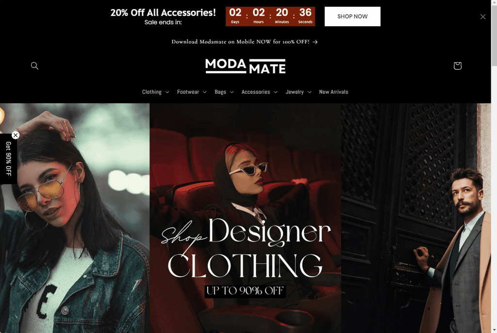


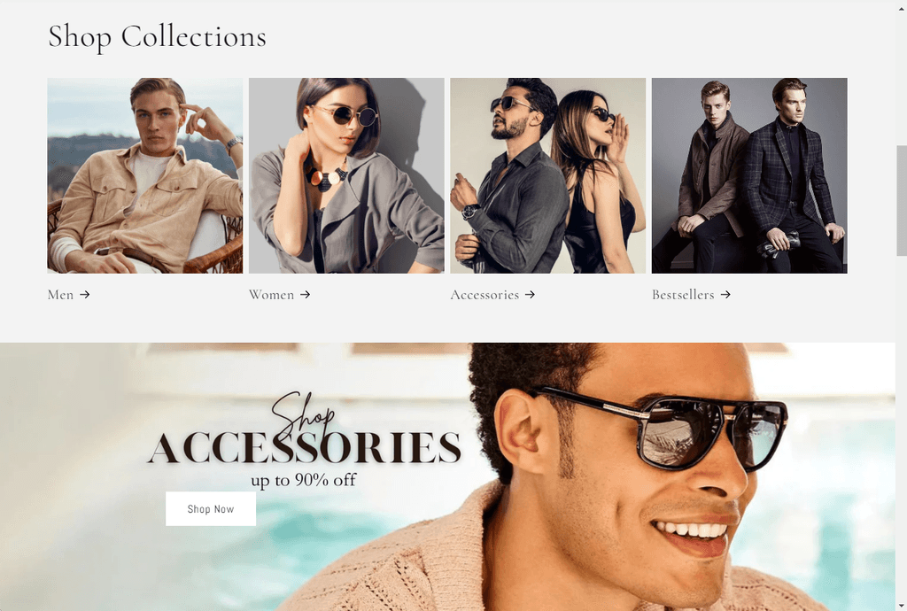


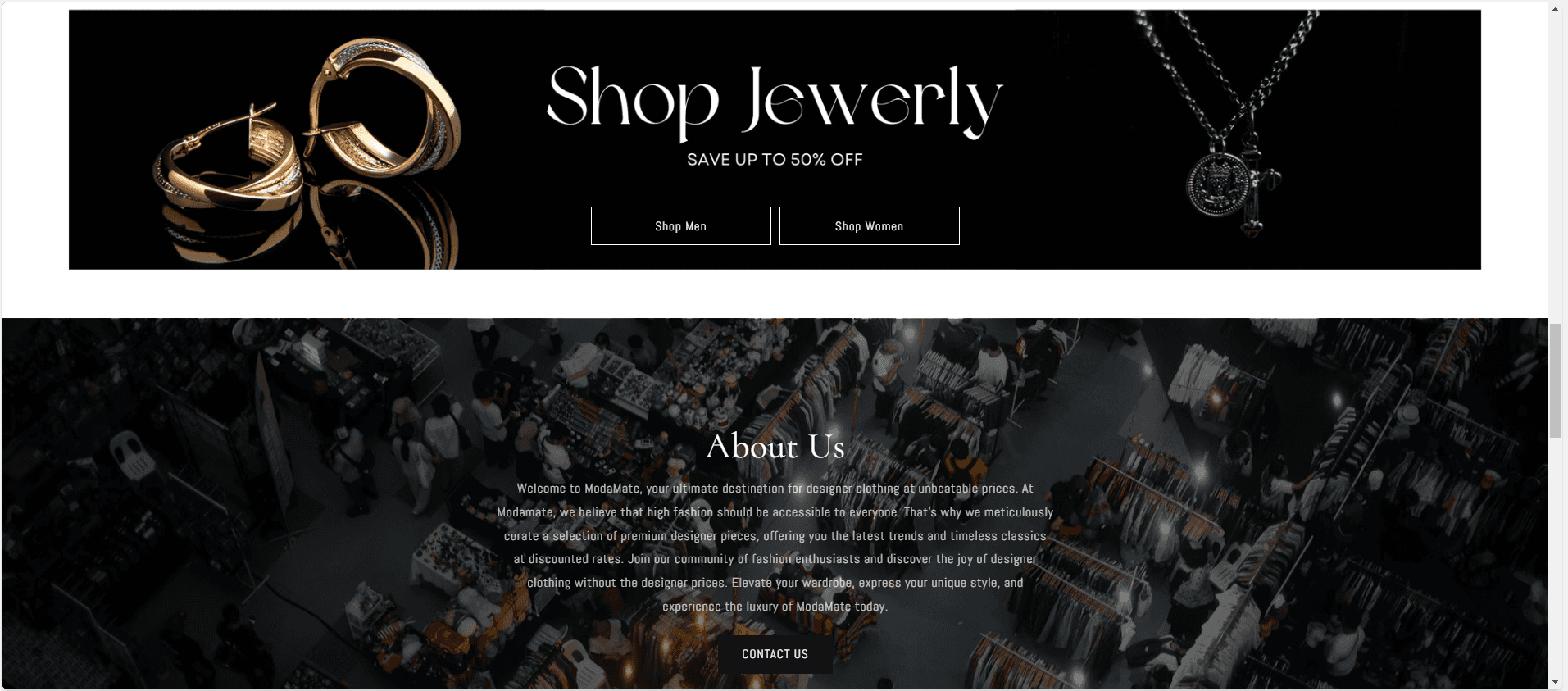


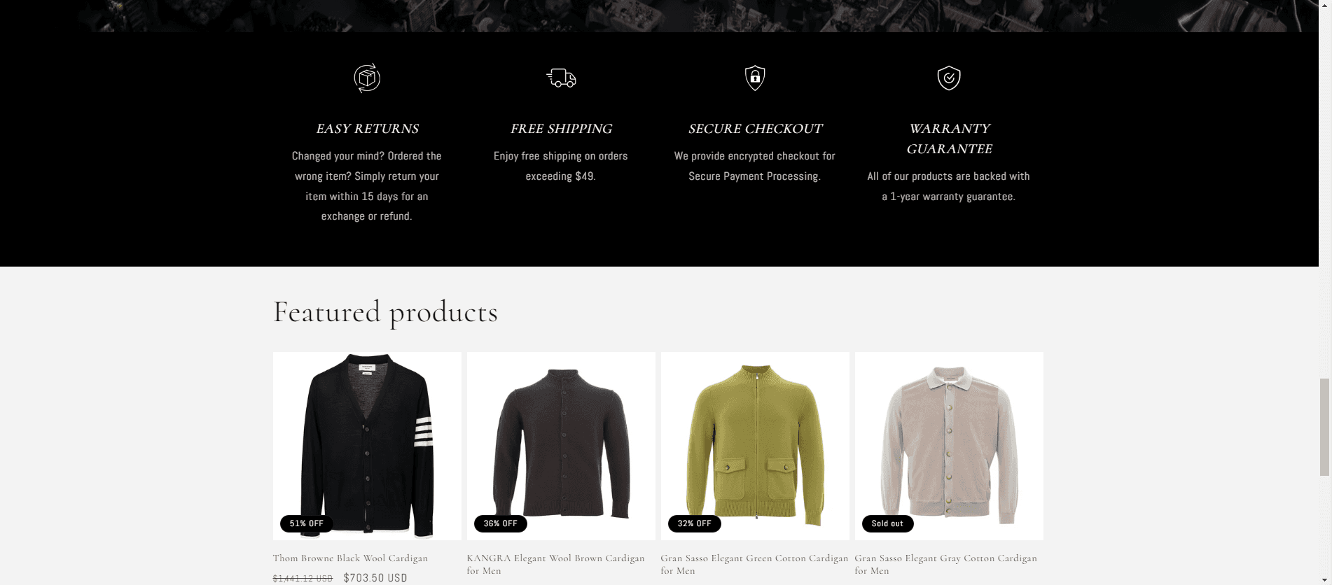


This stage of the process was the most time-consuming, as it required attention to detail and precision in creating visually appealing components that flowed well together. I spent countless hours selecting images that complemented the site's theme and aesthetic, striving to find the perfect balance between elegance and simplicity. Many of the graphics used in advertisements and product showcases were created on Canva, ensuring the visuals matched the style guide that was established earlier.
This stage of the process was the most time-consuming, as it required attention to detail and precision in creating visually appealing components that flowed well together. I spent countless hours selecting images that complemented the site's theme and aesthetic, striving to find the perfect balance between elegance and simplicity. Many of the graphics used in advertisements and product showcases were created on Canva, ensuring the visuals matched the style guide that was established earlier.
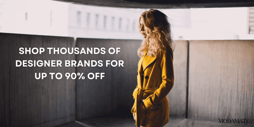




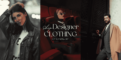


Through numerous iterations and refinements, the design gradually took shape. This included fine-tuning graphical elements, adjusting layouts, and making decisions on image placement to ensure everything felt cohesive.
Through numerous iterations and refinements, the design gradually took shape. This included fine-tuning graphical elements, adjusting layouts, and making decisions on image placement to ensure everything felt cohesive.
Mobile Design
Mobile Design
Mobile Design
With the web design established, the next challenge was translating it into a mobile app version while maintaining the same theme and visual appeal. My primary inspiration for the mobile design came from the Nordstrom app. One of the key insights I gained early on was that a light theme with dark text would be more suitable for mobile users, ensuring readability and ease of use. I kept the signature dark maroon as the accent color to preserve consistency with the brand.
With the web design established, the next challenge was translating it into a mobile app version while maintaining the same theme and visual appeal. My primary inspiration for the mobile design came from the Nordstrom app. One of the key insights I gained early on was that a light theme with dark text would be more suitable for mobile users, ensuring readability and ease of use. I kept the signature dark maroon as the accent color to preserve consistency with the brand.
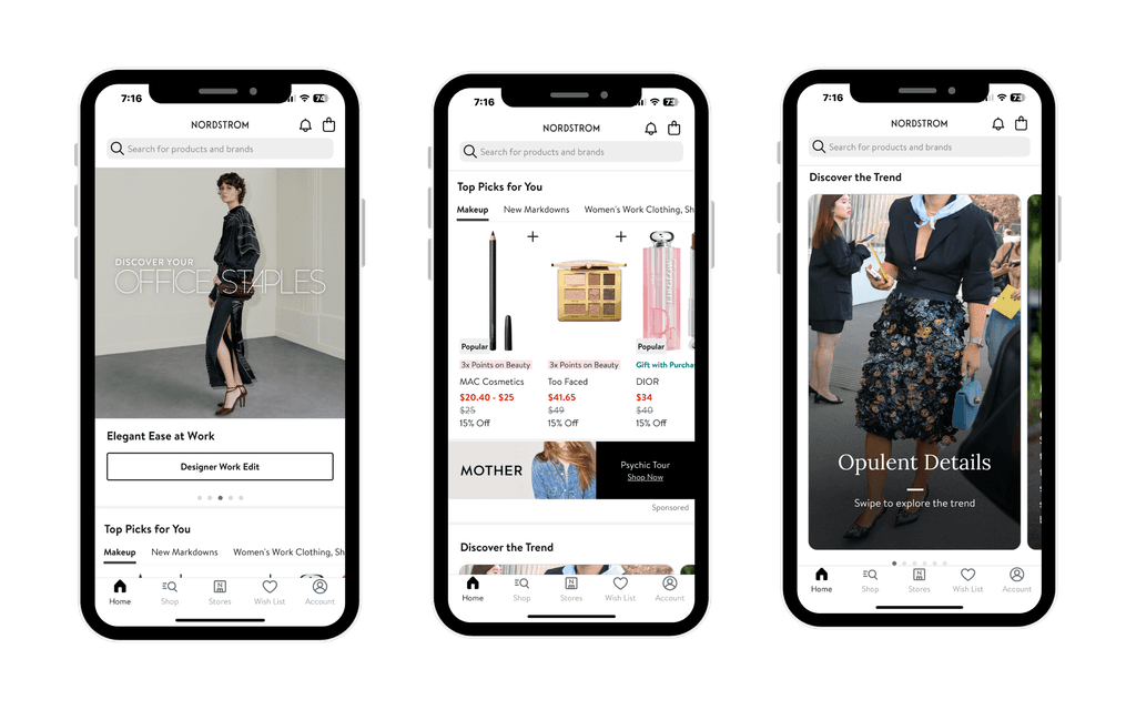


The layout for the mobile app had to be adapted to fit smaller screens while preserving functionality. I opted to move the navigation bar from the top of the screen (as it was on the website) to the bottom, where it would be more accessible on mobile devices. The new bottom navigation included key tabs: Home, Shop, Cart, Wishlist, and More—allowing users to quickly navigate through essential areas of the app.
The layout for the mobile app had to be adapted to fit smaller screens while preserving functionality. I opted to move the navigation bar from the top of the screen (as it was on the website) to the bottom, where it would be more accessible on mobile devices. The new bottom navigation included key tabs: Home, Shop, Cart, Wishlist, and More—allowing users to quickly navigate through essential areas of the app.
The homepage now featured an image carousel at the top, designed to immediately capture the attention of users with visually compelling promotions and products. Below that, I added a "Top Picks for You" section, displaying a rotating selection of curated items based on user preferences, making the shopping experience feel personalized.
The homepage now featured an image carousel at the top, designed to immediately capture the attention of users with visually compelling promotions and products. Below that, I added a "Top Picks for You" section, displaying a rotating selection of curated items based on user preferences, making the shopping experience feel personalized.
I maintained a similar flow to the web version by following the top picks section with a banner ad, then integrating a "New Trends" section that utilized a slideshow format to highlight popular trends. Lastly, the "Shop" tab on the app was adjusted to open a menu where users could select their preferred shopping categories. This differed from the dropdown menu on the website but felt more intuitive on mobile, offering a smooth and engaging user experience without overwhelming the screen.
I maintained a similar flow to the web version by following the top picks section with a banner ad, then integrating a "New Trends" section that utilized a slideshow format to highlight popular trends. Lastly, the "Shop" tab on the app was adjusted to open a menu where users could select their preferred shopping categories. This differed from the dropdown menu on the website but felt more intuitive on mobile, offering a smooth and engaging user experience without overwhelming the screen.
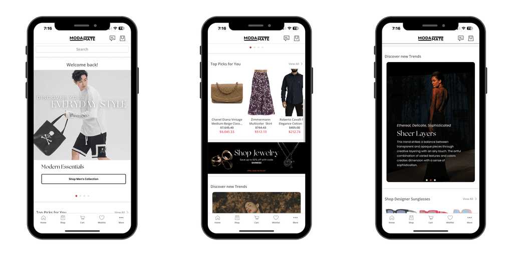


Through these adjustments, the mobile version of ModaMate retained the brand’s luxurious feel while ensuring an optimal, user-friendly interface on smaller devices.
Through these adjustments, the mobile version of ModaMate retained the brand’s luxurious feel while ensuring an optimal, user-friendly interface on smaller devices.
Conclusion + Takeaway
Conclusion + Takeaway
Conclusion + Takeaway
In conclusion, the redesign and development of ModaMate's website and mobile app resulted in a cohesive, modern platform that reflects the brand's luxury and accessibility. Throughout the process, from layout planning to prototyping and mobile conversion, I focused on creating an intuitive and visually appealing user experience.
In conclusion, the redesign and development of ModaMate's website and mobile app resulted in a cohesive, modern platform that reflects the brand's luxury and accessibility. Throughout the process, from layout planning to prototyping and mobile conversion, I focused on creating an intuitive and visually appealing user experience.
Although time constraints limited the depth of research I could conduct, particularly regarding extensive user testing, I was able to gather some valuable feedback from a handful of user trials. This feedback indicated that the clean design, seamless navigation, and personalized features resonated well with users. However, further testing and iterative refinements would be beneficial to optimize both the web and mobile experiences.
Although time constraints limited the depth of research I could conduct, particularly regarding extensive user testing, I was able to gather some valuable feedback from a handful of user trials. This feedback indicated that the clean design, seamless navigation, and personalized features resonated well with users. However, further testing and iterative refinements would be beneficial to optimize both the web and mobile experiences.
Overall, despite the challenges, the final product successfully met the project goals: creating a modern, easy-to-navigate shopping experience that aligned with the brand’s high-end identity across all platforms.
Thanks for reading!
Overall, despite the challenges, the final product successfully met the project goals: creating a modern, easy-to-navigate shopping experience that aligned with the brand’s high-end identity across all platforms.
Thanks for reading!
